


Before 2010, and before the mass popularization and adoption of mobile devices (smartphones and tablets), web developers had to go through the uninteresting and strenuous task of creating separate versions of webpages for mobile and desktop computer views. This method was unarguably not time-efficient or functionally efficient because of the inconsistencies in user experiences across different webpage versions. How should you do this now? This article will give the answers.
Session Replay for Developers
Uncover frustrations, understand bugs and fix slowdowns like never before with OpenReplay — an open-source session replay suite for developers. It can be self-hosted in minutes, giving you complete control over your customer data.

Happy debugging! Try using OpenReplay today.
Web Responsive Design: Mobile-first or Desktop-First?
Responsive Web Design (RWD) was first introduced in 2010 by web developer Ethan Marcotte. He suggested using now popular concepts like flexible grids and media queries to help ease the transition of webpages from desktop view to mobile view and vice versa. This greatly improved the overall web development process as the Herculean task of creating two separate versions of a web page was gradually abandoned. It only goes to say that the importance of RWD in the web development process cannot be overemphasized. It’s a terrible surfing experience where you have to zoom in and out now and then because of a poor RWD process. The idea of RWD insinuates that there has to be a smooth and seamless transition from desktop to mobile and vice versa. This further brings the dilemma of which route to take, from the top down or down up.
Mobile-first approach
You can easily imagine this as building your webpage from the ground up. Web development conventions tend to prefer this method to a desktop-first approach. This is understandable, considering the widespread use of mobile devices. Another reason for this is that most SEO rankings on search engines like Google favor websites with faster up times on mobile. The developer community understands that users will more readily visit websites with their smartphones and tablets than with their PCs; therefore, with that consideration in mind, they will follow the mobile-first approach when building websites.
Pros
The mobile-first approach has advantages in mobile app development as opposed to its desktop-first counterpart. We’ll explore some of them below:
Faster load times on mobile devices – Since the development process is optimized for mobile devices first, the amount of code written is less than desktop-first. Also, a developer would logically use fewer images and other resources like animations when designing web pages from the ground up (for a mobile device). When combined, all these give for a much faster loading time on mobile devices
Better user experience on mobile devices – Designing webpages with a mobile-first strategy usually creates a smoother experience and flow of elements while exploring. Developers can concentrate on building components that are both attractive and regular while also saving time on development.
Easier to scale up to desktop devices – One way to put this is that moving your web projects from a mobile-focused development standpoint to one of a desktop isn’t usually much of a hassle. Looking at it from a conversion perspective, you can rest easy knowing that your target mobile user base, which is mobile users, will be satisfied with your product. Therefore, moving on to design while considering from a psychological standpoint that favors desktop users will require less brain power. You wouldn’t need to consider as many factors as you would if you were doing the reverse.
Cons
- More difficult to create a desktop version from a mobile version – This shouldn’t be confused with scaling up, as mentioned in the pros. In this case, I’m referring more to the user interface than the user experience, which I focused on when discussing the pros. It is more challenging to resize your page components and resources to fit a desktop view as your browser viewport increases. Increasing your viewport might make it easier to identify parts of your UI that can accommodate newer components like buttons, floating animations, and the like, but then again, as with almost everything, building up is always more difficult than stripping down.
Desktop-first approach
Unlike the mobile-first approach, this is building your web pages from the top down. You can call it stripping down if you like, but a better term would be optimizing, seeing that you aren’t just removing stuff but making it look good and function properly on a smaller display. The desktop-first approach might be the first go-to for some developers for this one particular reason: the ease of design. It’s much easier to start developing a webpage from the desktop view first; it's almost fun, in fact. The wide viewport allows you to freely introduce several visuals and components like images and animations that you would have been careful to minimize if you were developing from the mobile-first standpoint.
Pros
Like the mobile-first approach, the desktop-first method also has pros. They are as follows:
A more detailed and dynamic desktop experience – It’s almost unarguable that viewing webpages on a desktop display is a much richer and more fulfilling experience than viewing them on mobile. It feels somewhat like you got to eat the whole meal; it’s refreshing. Your webpages are more likely to have that refreshing and fulfilling effect when built with a desktop-first approach. You get to adequately portray whatever brand your website represents by including its colors and visuals in all their fullness.
Easier to create a mobile version from a desktop version – As I stated earlier, building up is always harder than stripping down. As your viewport screen size reduces, gradually maintaining a suitable webpage experience is much easier because most of the work to be done involves size reduction, total removal, or just a switch from a
flexdisplay type to ablockdisplay type for some elements, depending on the style of your UI. This reduces the RWD workload considerably, and you also get to reduce your code length in an efficient and organized manner. The following code shows the media query section of a CSS code written for a website utilizing a desktop-first approach:
/*Media Query*/
@media screen and (width <= 1075px) {
   .about-subdiv {
       display: block;
   }
   .viewlink-btn {
       margin-bottom: 0px;
   }
   .project-ee, .project-steakholder, .project-moviebox {
       display: block;
   }
   .bio, .skills {
       padding-left: 40px;
   }
   .bio-br {
       display: unset;
   }
}
@media screen and (width <= 1043px) {
   .contact-form {
       width: 100%;
   }
   .contact-form-div {
       padding: 0px 40px 0px 40px;
   }
}
@media screen and (width <= 767px) {
   .social-media {
       display: none;
   }
   #about h2, #projects h2, #contact h2 {
       font-size: 1.7em;
   }
   .bio h3, .skills h3 {
       font-size: 1.3rem;
   }
   #projects h3 {
       font-size: 1.3rem;
   }
   .navbar {
       padding: 20px 20px 20px 20px !important;
   }
   .navbar .nav-item {
       border-top: 1px solid rgb(214, 208, 208);
   }
   #about {
       margin: 0px 20px 0px 20px;
   }
   .about-subdiv {
       padding-left: 0px;
   }
   .bio, .skills {
       padding: 0px;
   }
   #projects {
       margin: 0px 20px 0px 20px;
   }
}
@media screen and (width <= 469px) {
   .footer-desc br {
       display: none;
   }
}
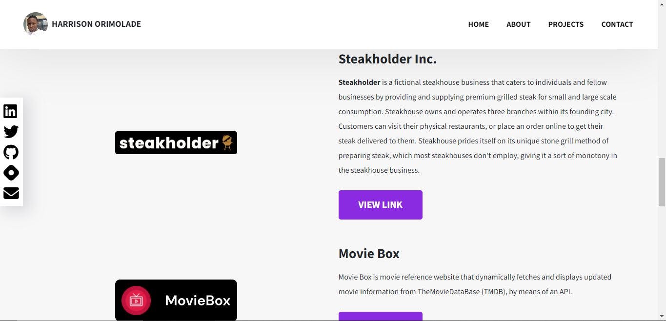
Looking closely at the CSS code above, you would notice that most selectors for their corresponding HTML elements have just one line of code declaration within their code blocks. This shows that very minimal changes were made to the styling of the elements while scaling down to a mobile version. To illustrate this explanation, consider the screenshot below that shows the desktop view of the project section on my portfolio site. The projects Stakeholder Inc. and Moviebox are seen displayed in flex display format.
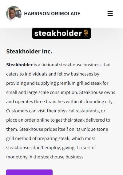
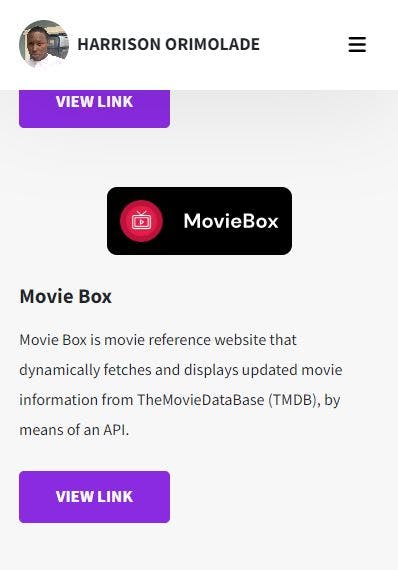
The following screenshots, however show the same section in mobile view, where the projects are displayed in block display format, as indicated in the code block above:
And:
.project-ee, .project-steakholder, .project-mangallo {
   display: block;
}
The only change made to the styling of the section was that of the display from flex to block.
Cons
As beautiful and enticing as the desktop-first pros make it sound, it has its let-downs as well, including:
Slower load times on mobile devices: You may be able to reduce your code length neatly and efficiently when scaling down your webpage, but you may not be able to reduce it by a lot. This would most probably lead to slower load times when your website is viewed on a mobile device and, in turn, reduced traffic and conversions for your website.
Poorer user experience on mobile devices: A poor user experience is one that isn't soothing or easy when exploring the webpage. Designing from a desktop-first perspective can make your webpage cluttered when viewing it on a mobile device. Because the display is smaller, all elements critical to the webpage that could not be fully altered or possibly removed tend to cringe together, giving a choked feeling while browsing.
Comparison between Mobile-first and Desktop-first approaches
| Mobile-first | Desktop-first |
| Pro – Faster load times on mobile devices | Con – Slower load times on mobile devices |
| Pro – Better user experience on mobile devices | Con – Poorer user experience on mobile devices |
| Con – More difficult to create a desktop version from a mobile version | Pro – Easier to create a mobile version from a desktop version |
| Pro – Easier to scale up to desktop devices | |
| Pro – More detailed and dynamic desktop experience |
Looking at the table above, we can see how nicely the mobile-first pros stack up against the desktop-first cons. It, however, is not an exhaustive list of their respective advantages and disadvantages and so may not be an accurate determinant of which is better for web development. This can only act as a guide for a developer to determine which best works for them.
Ultimately, your choice will largely depend on the type of project being worked on, its purpose and scope, and its target users. A website designed for a corporate business or construction company will most likely benefit from a desktop-first approach. In contrast, one designed for an e-commerce or food order business will benefit from the mobile-first approach. Whatever approach you choose should always closely imitate existing industry standards for an awesome user experience and, ultimately, greater traffic and conversions.